WORK / KISS BEAUTY GROUP / CORPORATE WEBSITE
Building the corporate identity from scratch
01 · SHIPPED 2024–2026 · KISS BEAUTY GROUP
A 16-month rebrand that gave a 10+ brand beauty company its first distinct corporate voice — separated from the consumer brand, and structured so partners, press, and talent could finally find it.
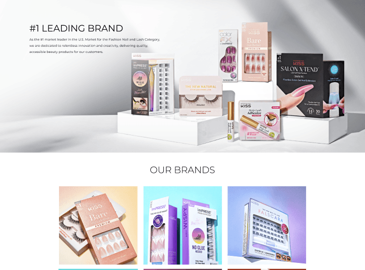
FIG. 01 — KISSBEAUTYGROUP.COM, LIVE
✦ OUTCOMES
59 stakeholder interviews
C-suite, employees, and industry experts. Every structural decision on the site traces back to what we heard.
10+ brands, one architecture
A growing portfolio, previously fragmented across siloed pages, now lives in a single navigable site serving 100+ countries and 60,000+ retail doors.
ROLE
Design Lead & Project Owner. End to end: IA, UX, content systems, QA, launch.
TEAM
2-person Brand & Communications team. Partnered with Cheil Worldwide and internal Creative, Marketing & Strategy teams.
TIMELINE
16-month scope. Released 2024–2026.
TOOLS
Figma · WordPress · Asana · Canva
✦ 01
Problem Discovery
Who is this site actually for, and what do they need to find?
STAKEHOLDER RESEARCH
Before any page was designed, I ran 59 stakeholder interviews across C-suite, employees, and industry experts, with structured protocols per group, in partnership with Cheil Worldwide.
Leading beauty groups separate the parent company from the brands beneath it. KISS did not — its corporate entity and flagship consumer brand shared one name, logo, and website.
COMPARATIVE ANALYSIS
A group brand can create portfolio clarity without becoming the legal parent.
Estée Lauder shows the value of a recognizable group-level identity. For KISS, the opportunity was to mirror that navigational clarity while carefully distinguishing the umbrella brand from its affiliated companies.
LEGAL ENTITY
Estée Lauder Companies
WHOLLY OWNED SUBSIDIARIES
CLINIQUE
M·A·C
AVEDA
JO MALONE
BOBBI BROWN
LA MER
ESTÉE LAUDER
→
BRAND NAME ONLY
KISS Beauty Group
AFFILIATED COMPANIES
KISS
RED
IVY BEAUTY
AST
CONSUMER BRANDS & FRANCHISES
KISS
imPRESS
FALSCARA
RUBY KISSES
KISS NEW YORK
RED
KISS COLORS & CARE
i·ENVY
THE FARRAH
…and affiliated companies worldwide
FIG. 02 — MULTI-BRAND BEAUTY GROUP LANDSCAPE
WHAT WE HEARD → WHAT IT CHANGED
The company and its flagship brand were indistinguishable.
KISS Beauty Group became a distinct corporate identity and site, separated from consumer-facing kissusa.com.
The company story overlapped and diluted itself.
Consolidated into Our History with a founding story and key-moments timeline; careers moved to its own dedicated home.
Structure follows story.
The homepage leads with one narrative hero; brands, commitments, and news each got a considered section.
Three findings from 59 conversations. Each one changed the structure of the site before a page was designed.
THE PROBLEM
A 10+ brand global company with no unified voice, no content structure, and no public website — and partners, press, talent, and customers with no single place to understand it.
✦ 02 — FOUNDATION: THE NARRATIVE FRAMEWORK
From 59 conversations to one story
The interviews gave us raw material. The framework gave us a decision rule. We mapped what we heard onto a Golden Circle — why the company exists, how it operates, and what it makes — so every page and module had to serve the narrative to ship.
WHY
HOW
WHAT
WHY · VISION
To empower everyone to celebrate their beauty.
HOW · CORE Values
Consumer first · Respect for One Another · Pursuit of Excellence · Thriving together
WHAT · MISSION AS A COMPANY
To create exceptional solutions for effortless beauty.
TAGLINE
Effortless Beauty for Everyone.
✦ 03 — INFORMATION ARCHITECTURE
A portfolio needs a path, not a pile of pages
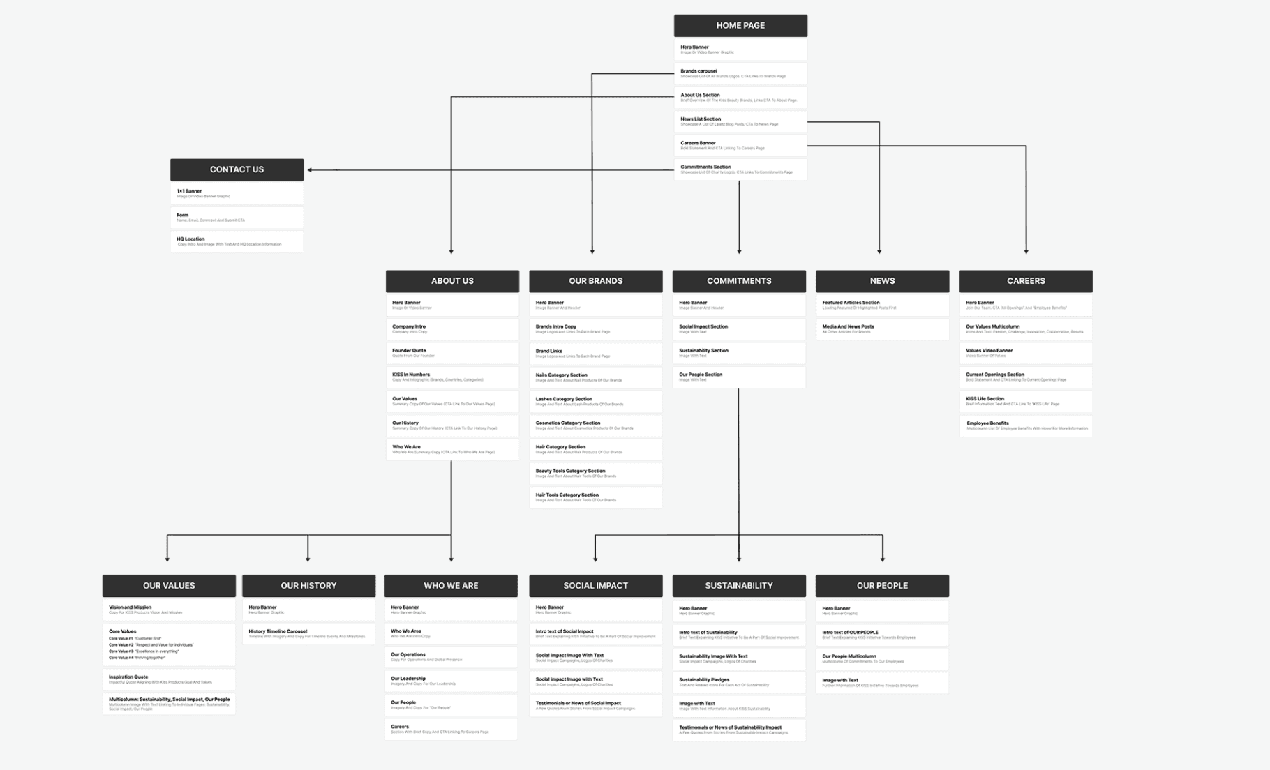
A 10+ brand portfolio needed one clear taxonomy, so every page could inherit the same navigable structure.
FIG. 03 — SITE TAXONOMY AND PAGE HIERARCHY
The choices that made the structure work
CAREERS NEEDED ITS OWN PATH
Careers had been living inside the company story. Separating it gave talent a dedicated path and let the corporate narrative remain a story instead of a recruitment pitch.
SEPARATE PATHS FOR SEPARATE NEEDS
Portfolio, commitments, news, and careers each became a clear top-level destination — so partners, press, talent, and consumers could find the right story without navigating through the same one.
✦ 04 — DESIGN DIRECTIONS
Three directions, evaluated against the narrative
Three credible directions were evaluated against readability, brand expression, and buildability with the stakeholder team.
VERSION C — SHIPPED ✓
Minimal structure
Clean templates on white and red. Readability and content clarity first.
DECISION · A structure that carries the story without competing with it.
VERSION A
Bold brand
Full KISS red fields, high contrast, maximum brand impact.
TRADE-OFF · The most unmistakable page was also the hardest to read at length.
VERSION B
Editorial arch
White fields, arched image frames, airy and elegant.
TRADE-OFF · The fashion-adjacent softness read as a different company than the one in the interviews.
✦ 05 — CONTENT SYSTEMS
A system for content that arrives in every shape
A shared page model turned ten different incoming content shapes into one consistent, maintainable publishing system.
FIG. 04 — PAGE MODELS, MODULES, AND WORKFLOWS
WHY THIS MATTERS
The system is why the site still holds together now that I’m not the one publishing to it.
✦ 06 — QA & DESIGN REVIEW
Catching structure problems at page level
A site assembled by many hands drifts: inconsistent styles, missing pathways, and small errors that quietly erode trust. I ran structured design reviews across every page — each issue flagged, decided, and seen through to resolution.


AUDIT
Review finding: the brand section had no clear next step.
BEFORE — A LOGO WALL
Brands were visible, but their scale and destination were unclear.
AFTER — A CLEAR NEXT STEP
“Explore Brands” adds a destination and turns the section into a path forward.


AUDIT
Review finding: portfolio hierarchy needed a stronger visual order.
BEFORE — FLAT HIERARCHY
Titles sat in a flat line, making the portfolio harder to scan.
AFTER — A CLEARER PORTFOLIO PATH
Regrouped content and defined a hierarchy that gives every portfolio item a clear place in the story.
THE PRACTICE
Every review turned invisible structural drift into an explicit decision: flag it, align on it, and see it through to resolution.
✦ 07 — FIGMA TO LIVE ON WORDPRESS
Designing for the team who inherits it
STEP 01
Wireframe in Figma — the backbone the live site runs on.
STEP 02
Design in Figma — the broader direction and internal visual system.
STEP 03
Live on WordPress — shipped for the team who owns it next.
WordPress wasn’t a constraint I worked around. It was the point.
A two-person Brand & Communications team would own the site after launch, with no developer on standby. Designing within a platform they could maintain meant the structure survives past the project — a system a non-technical team can run is worth more than a system that needs me in the room.
Wireframe → Design → Live on WordPress
FIG. 05 — WIREFRAME → DESIGN → LIVE ON WORDPRESS
OUTCOME
Shipped, live, and structurally sound
The site is live at kissbeautygroup.com. Portfolio of Brands, Careers, and Commitments now make the research-backed architecture visible in the product. Performance measurement is ongoing.
TAKEAWAYS
Structure is a strategy problem before it’s a design problem. Separating the corporate identity from the consumer brand came out of interviews, not wireframes.
A system you hand off is worth more than a system you hold. The best structure here is the one that stays intact without me.
Alignment is the deliverable. The work was building a framework strong enough that people with different answers could agree on the same structure.
I’m curious about you :)
Let’s chat!
SAY HELLO
01 EMAIL
02 LINKEDIN
03 INSTAGRAM
NAVIGATION
01 WORK
02 PLAY
03 ABOUT
04 RESUME
LAST UPDATED JUL 2026 · BUILT IN FRAMER · NEW YORK CITY